


The Surveyor Surveyed
Notes on L'Arpenteur
In January of 2025, my first French-language comic book L’Arpenteur (“The Surveyor”) was released by Casterman – a “deconstructed sci-fi/coming-of-age hybrid with wild off-genre mood swings”. It is a stripped down yet reference-heavy affair, with nods to early Métal Hurlant, introspective Gekiga manga and the haphazard storytelling stylings of Nouvelle Vague cinema. This Journal entry tries to unpick a fraction of its influences and some of the steps involved to create this post-apocalyptic fable.
Continuing a strain from my 2021 book Bestiarium and my short Late Heavy Bombardment, in L’Arpenteur we follow a marooned young man wandering a ravaged landscape – a seemingly uninhabitable Earth – in search of his home. Along the way he is forced to come to peace with his strange and ever-shifting surroundings, as well as his own nature.
During a routine off-world mission, our protagonist, poignantly named Géo, loses his home – Avalon, an artificial, faux-Earth habitat. Stranded on a desolate planet Earth, ravaged by climate change and relentless flooding, Géo finds himself in a hostile, alien environment. What was once familiar has now become an unrecognizable, trash-strewn wilderness. Over the course of a year-long journey on foot to find his way back, Géo faces a series of trials that test both his physical endurance and his character. His experiences begin to challenge his loyalty to his former Avalonian existence, making him question everything he once believed about the world and his place within it.
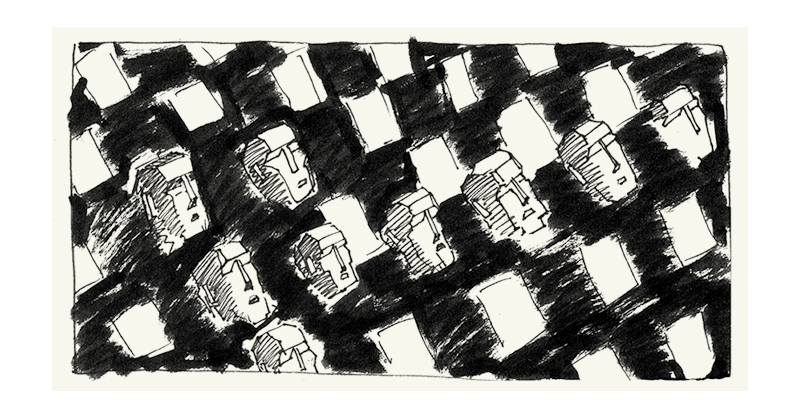
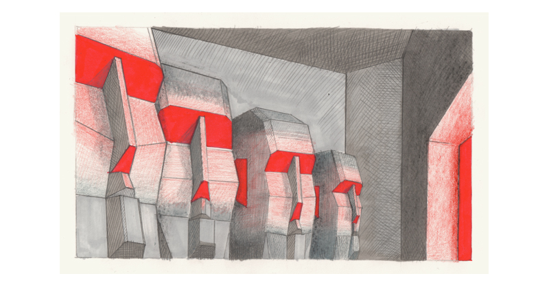
 |
 |
 |
 |
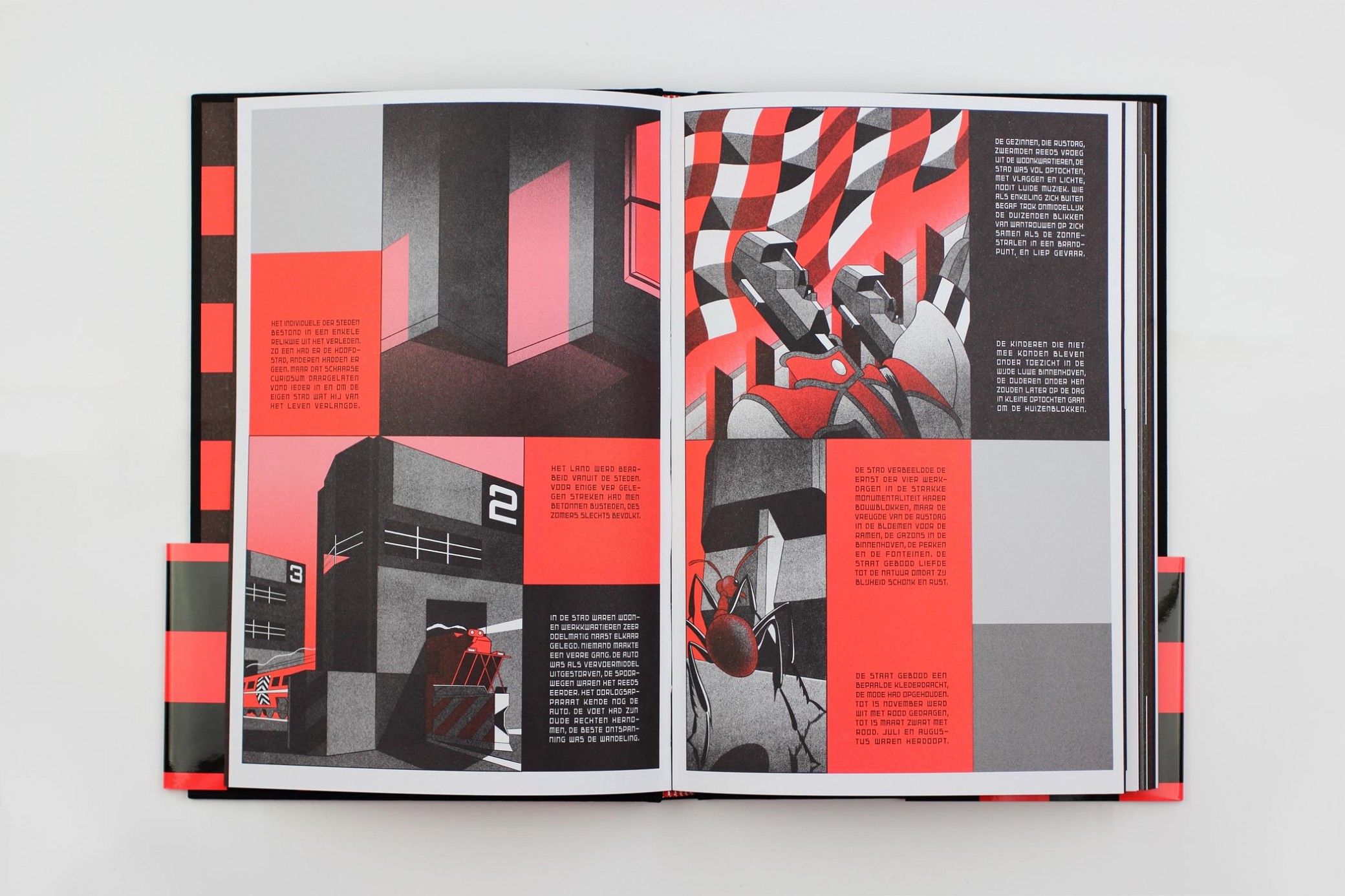
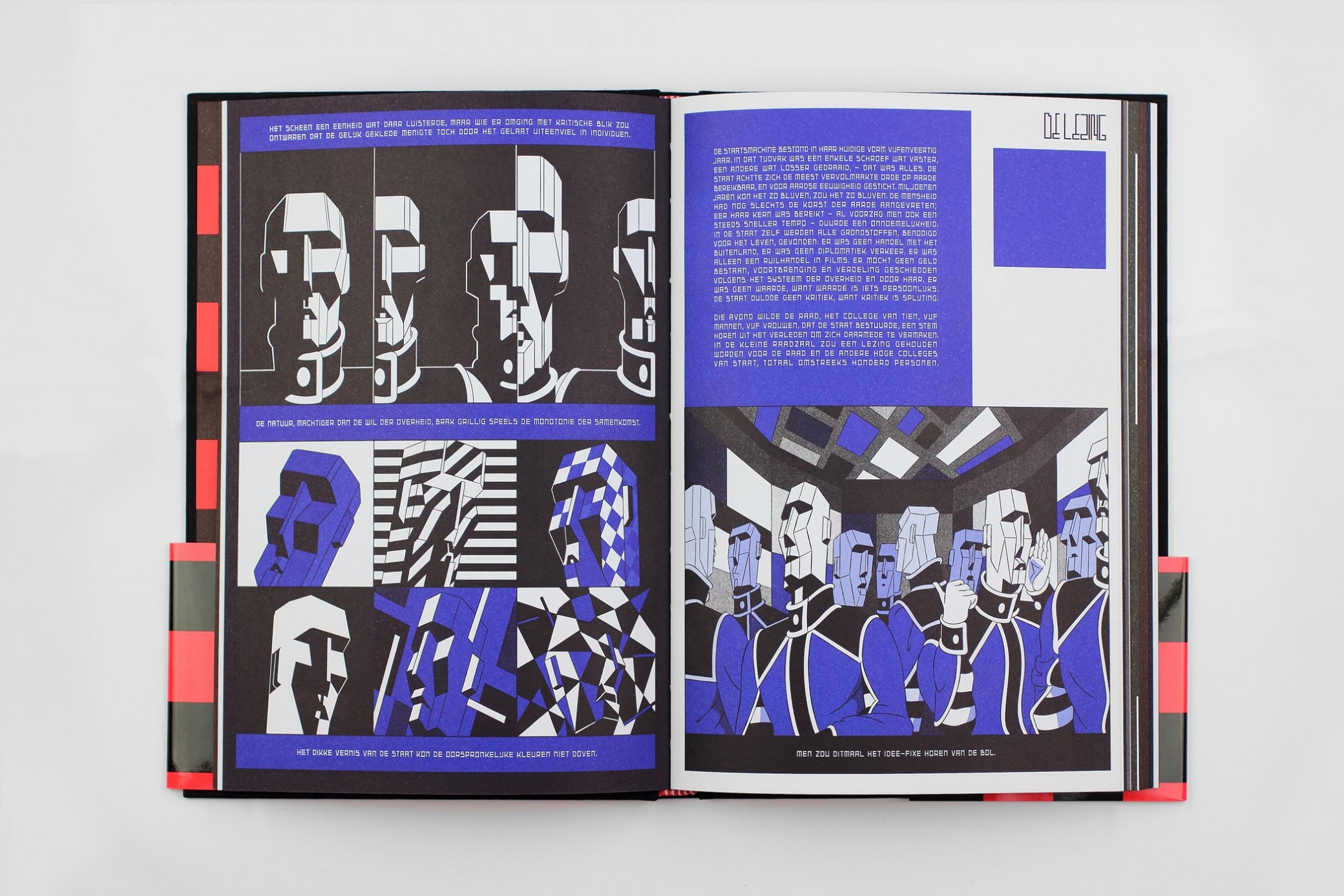
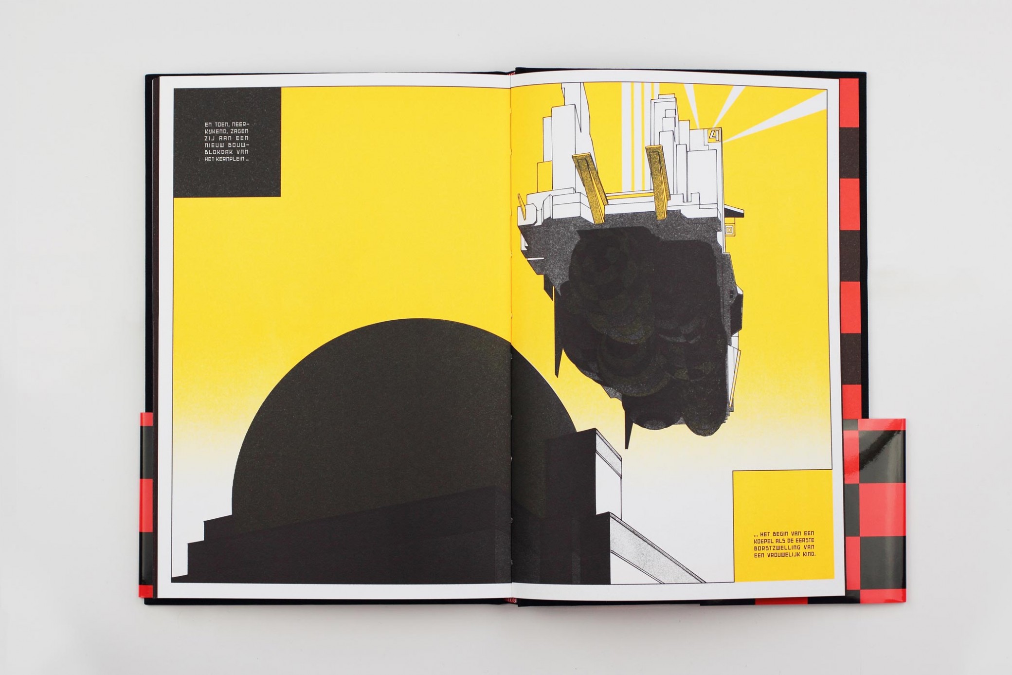
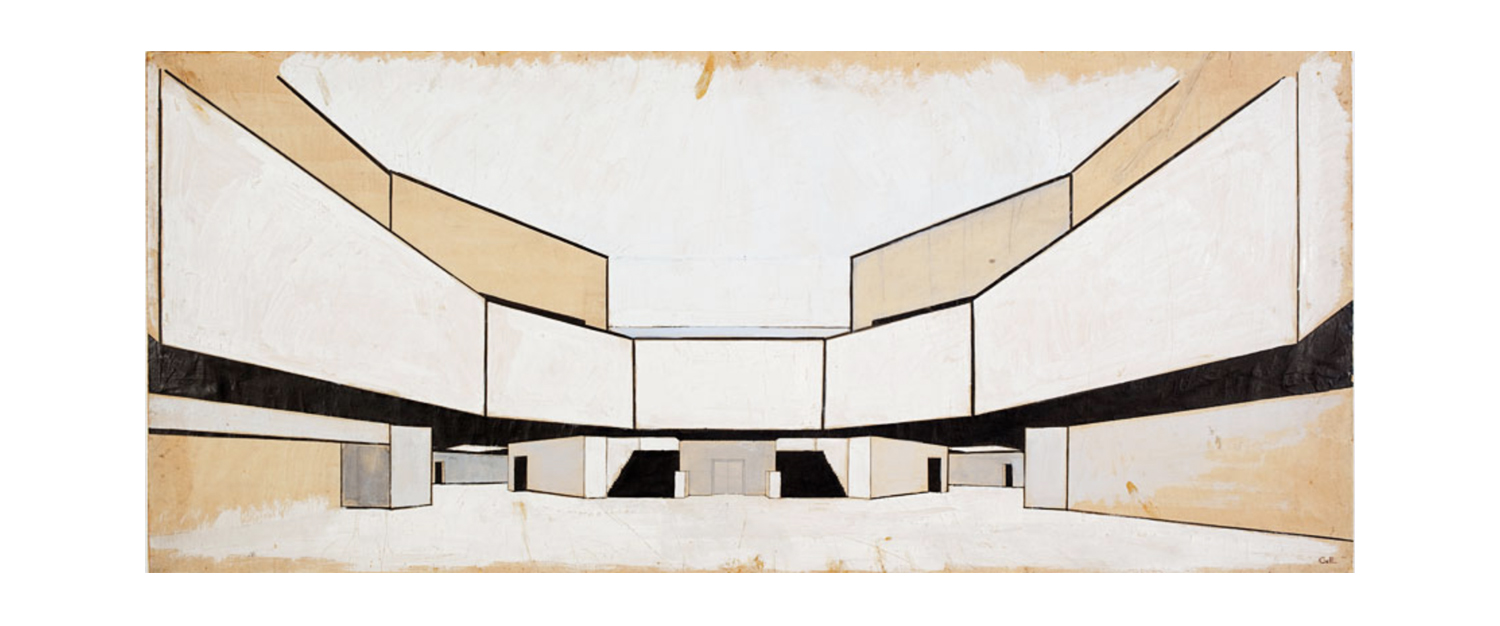
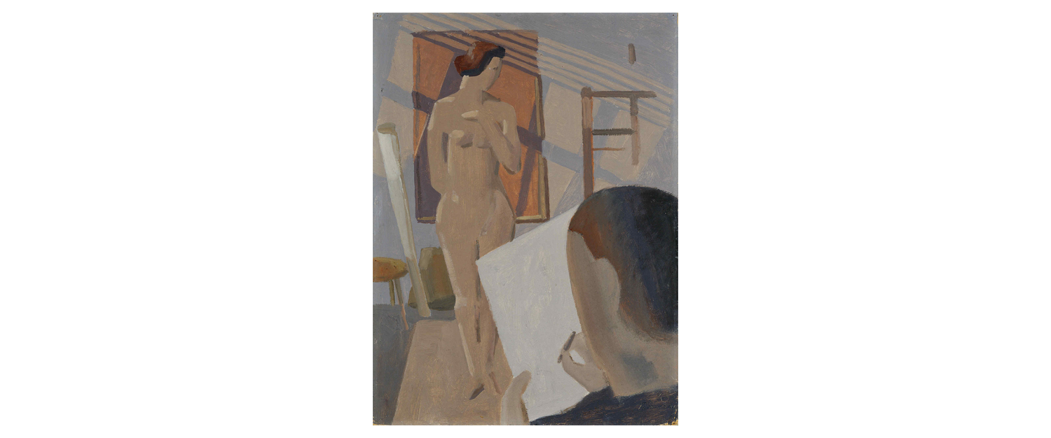
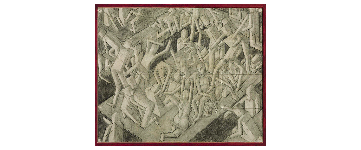
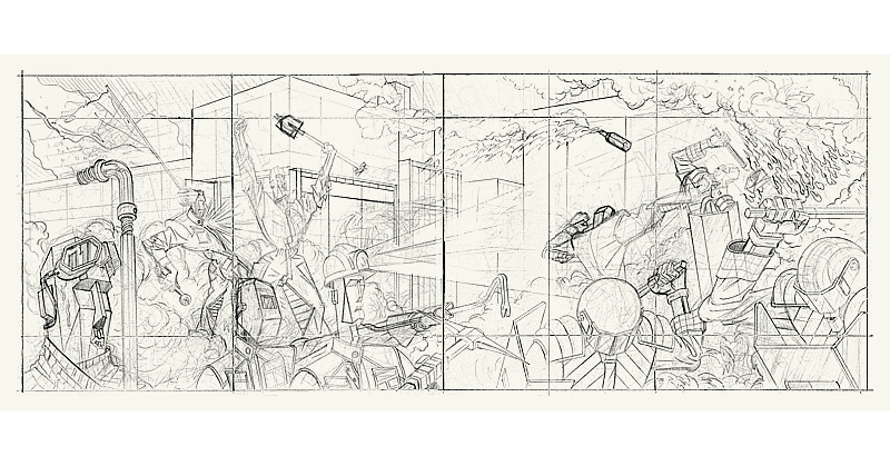
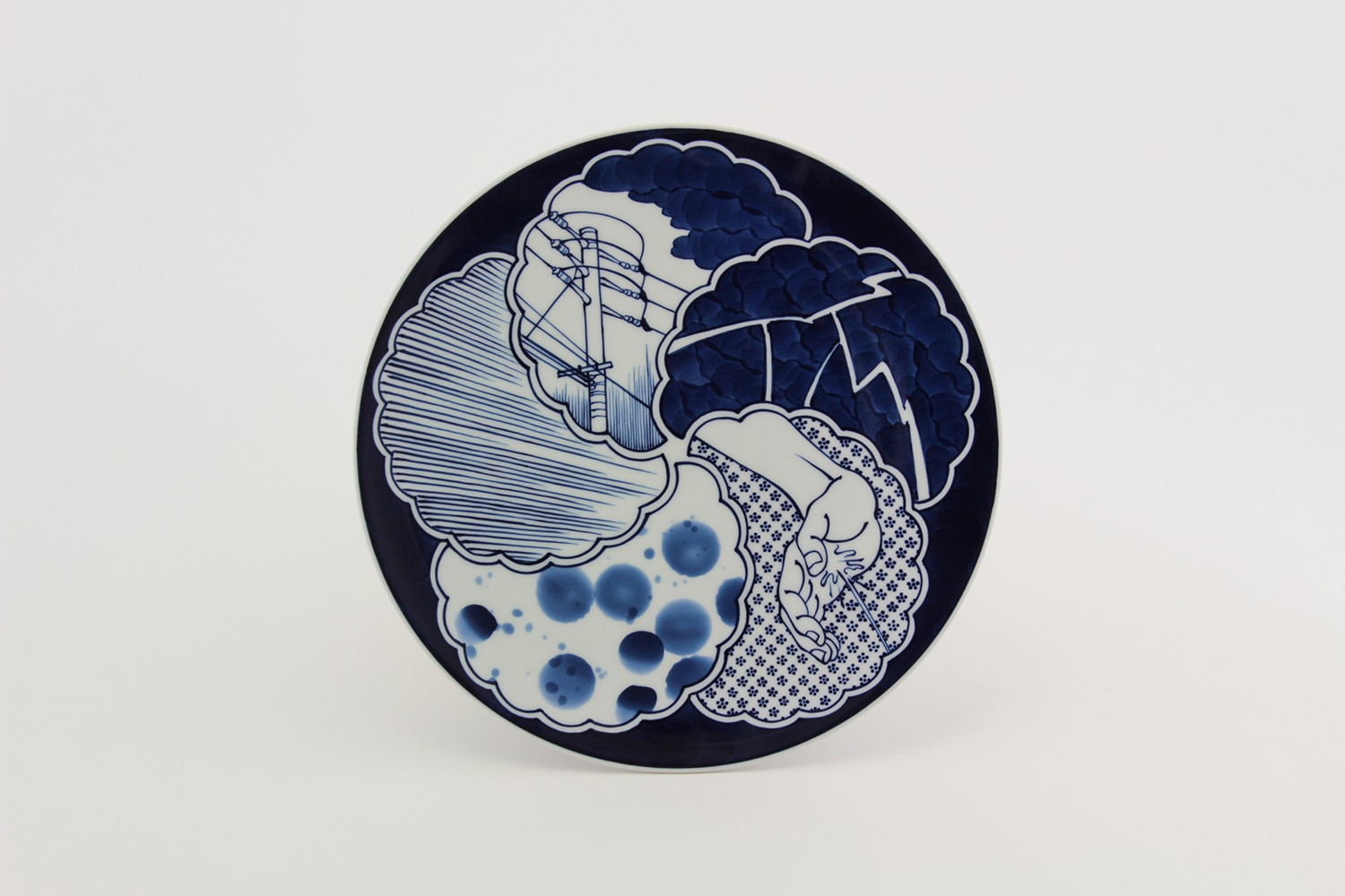
Various spreads from L'Arpenteur. photo: eline moormann
A Post-Apocalyptic Fable
This post-apocalyptic story is built around the simple premise above, but it aims to reflect a vision of the world that has been haunting our present for quite some time. It subtly touches on themes like growing inequality, the darker aspects of technology, and (perhaps most urgently) the looming threats of climate change, exploring how these forces might reshape our environment and the ways we live.
At the heart of the story is the concept of a space garbage collector crash-landing onto an alien planet, which could be seen as a classic trope of science fiction – one that harkens back to the genre's pulpy roots. By choosing this familiar, almost "nostalgic" setup, I hope to spark a sense of cynicism in the reader. How long have we been entertained by these dystopian visions without seriously confronting the real and present dangers they mirror? Through the fragmented, poetic inner monologue of the protagonist, I’ve aimed to evoke a growing sense of unease. While the book can ultimately be seen as a story of hope, it also serves as a reflection on our collective and individual despair.
The Tempest
Inspired by Robinson Crusoe, in which the titular hero voraciously reads from his Bible, our central character comes across a copy of Shakespeare’s The Tempest. What begins as a light-hearted escape from the monotony of survival soon becomes a profound tool for Géo’s understanding of life on Earth, its terrestrial ways, its social systems and established hierarchies.
Originally marketed as a comedy, Shakespeare's final play (written around 1610) offers a seemingly simple narrative that touches on complex, enduring themes, veiled in the guise of a fairytale. These themes remain relevant today – delving into issues such as colonialism, racism, and the ethical question of human dominion over others, as well as the natural world.
Upon revisiting The Tempest multiple times, the character of Ariel, an “air spirit” bound to serve the magician Prospero, stood out to me. Though Ariel is referred to with the pronoun "him" throughout the play – perhaps due to historical gender roles on stage – modern interpretations however often cast actresses in the role, calling Ariel's gender into question. Rather than focusing on Prospero, often regarded as the central character, I chose to highlight Ariel, who in L'Arpenteur serves as a psychopompic guide to the earthly underworld.
In light of its intertextual connections to the history of science fiction, it’s also worth noting that The Tempest served as the basis for Forbidden Planet, the iconic 1956 Hollywood sci-fi film. Though considered a pulp work, Forbidden Planet laid the groundwork for many science fiction stories that followed.
Métal Hurlant
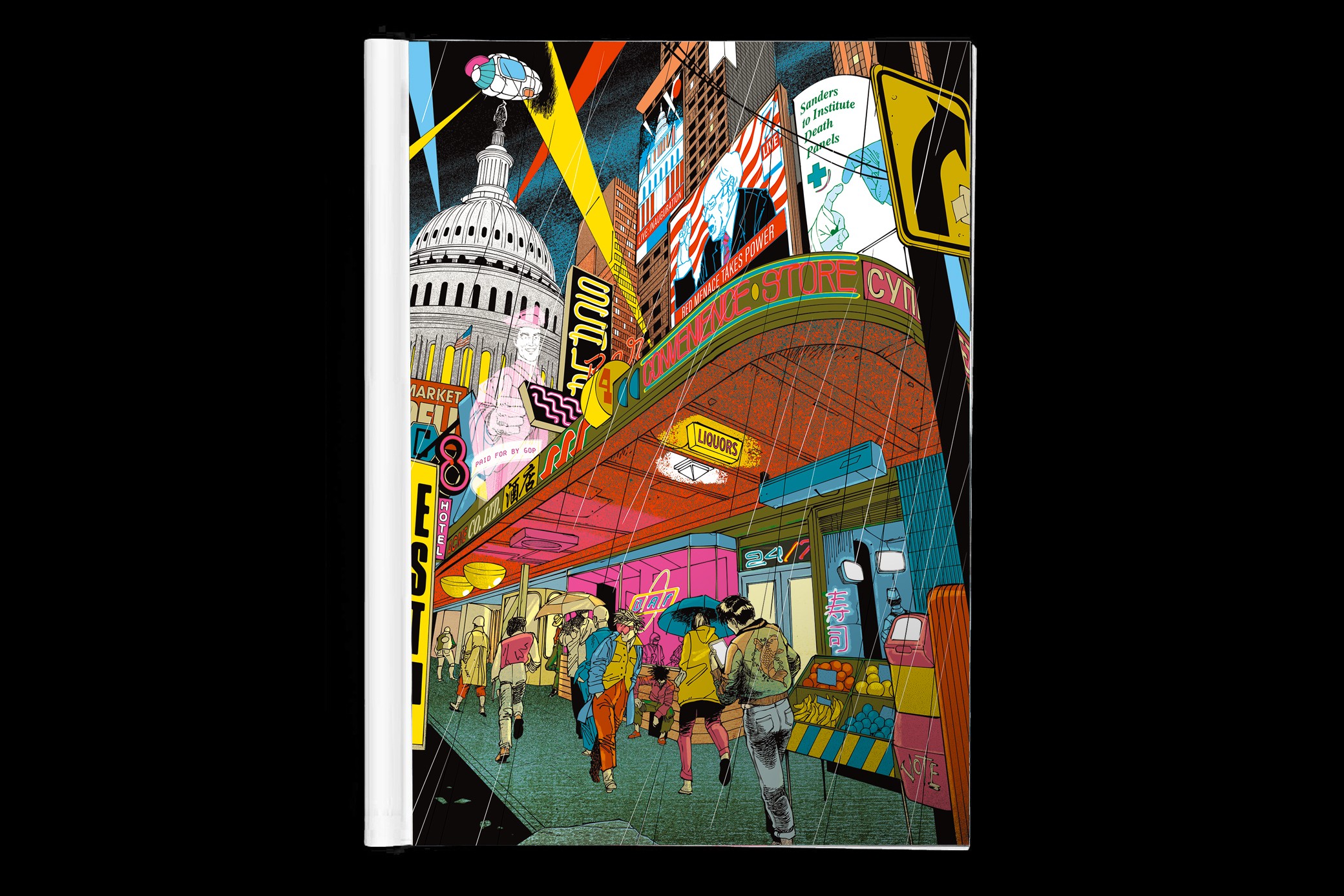
Although L’Arpenteur appears to draw on (and is undeniably inspired by) nostalgic science fiction works, it also uses this framework to subtly explore themes of mental anguish, often through a light-hearted lens. Central to this approach is the influence of Métal Hurlant, the revolutionary French sci-fi comics magazine that became a showcase for the era's most influential comics creators, including Mœbius, Druillet, and Caza.
Like the best examples of science fiction, Métal Hurlant reflects the anxieties of its chaotic present, projecting them into a richly detailed vision of the future. It is simultaneously satirical, comedic, and poignant, capturing the aftershocks of Vietnam, countercultural protests and the ensuing Cold War. The shadow of the nuclear mushroom cloud looms large in these comics, a sentiment that feels as relevant today as it was then.
 |
 |
 |
 |
 |
 |
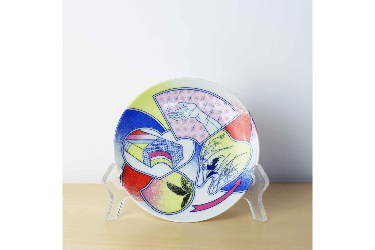
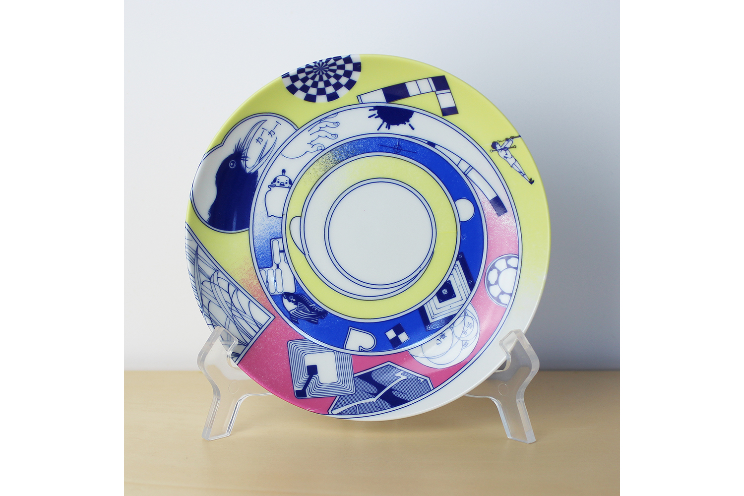
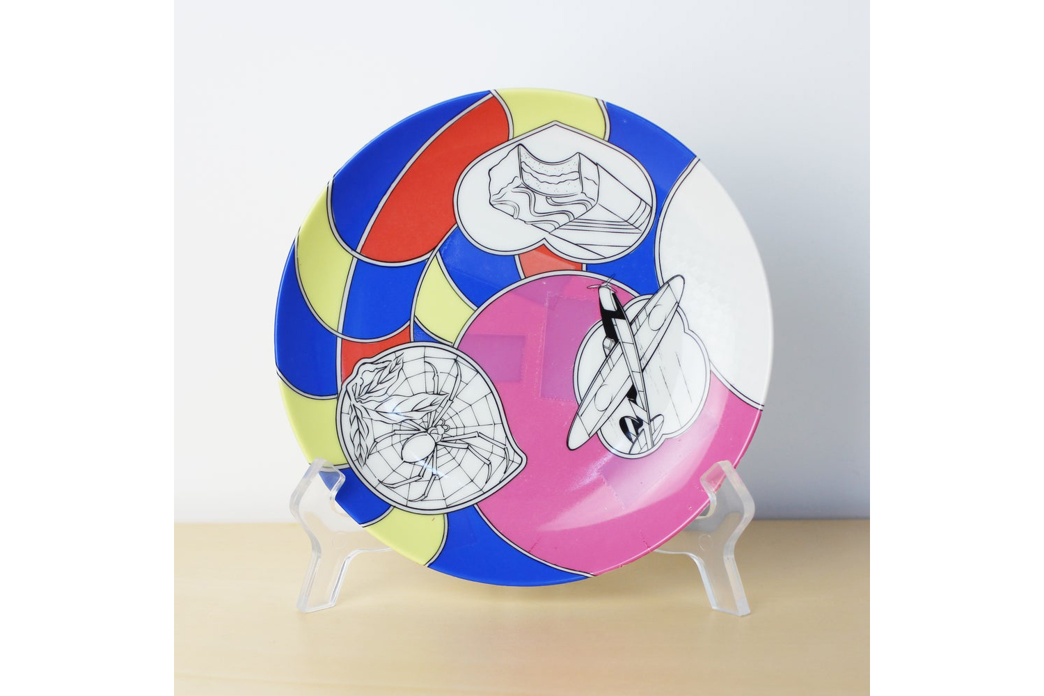
Color test collages. photo: eline moormann
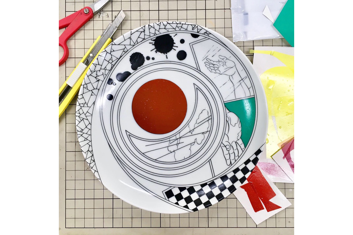
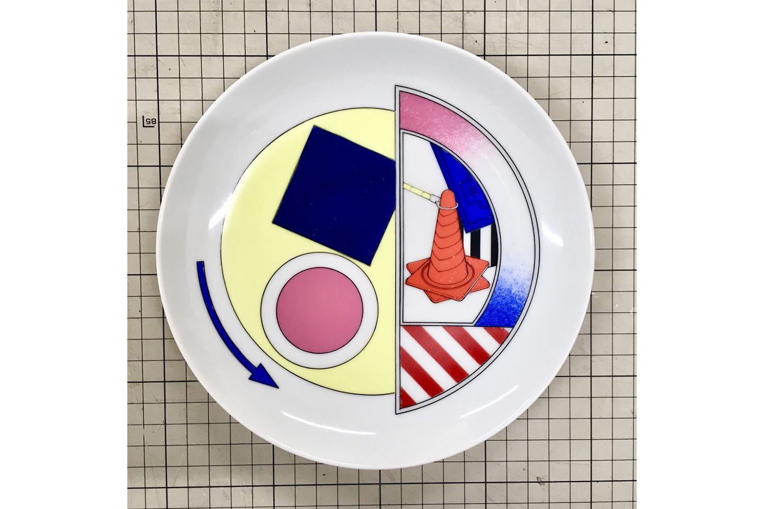
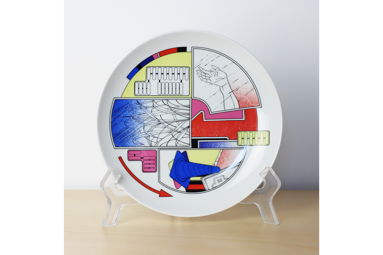
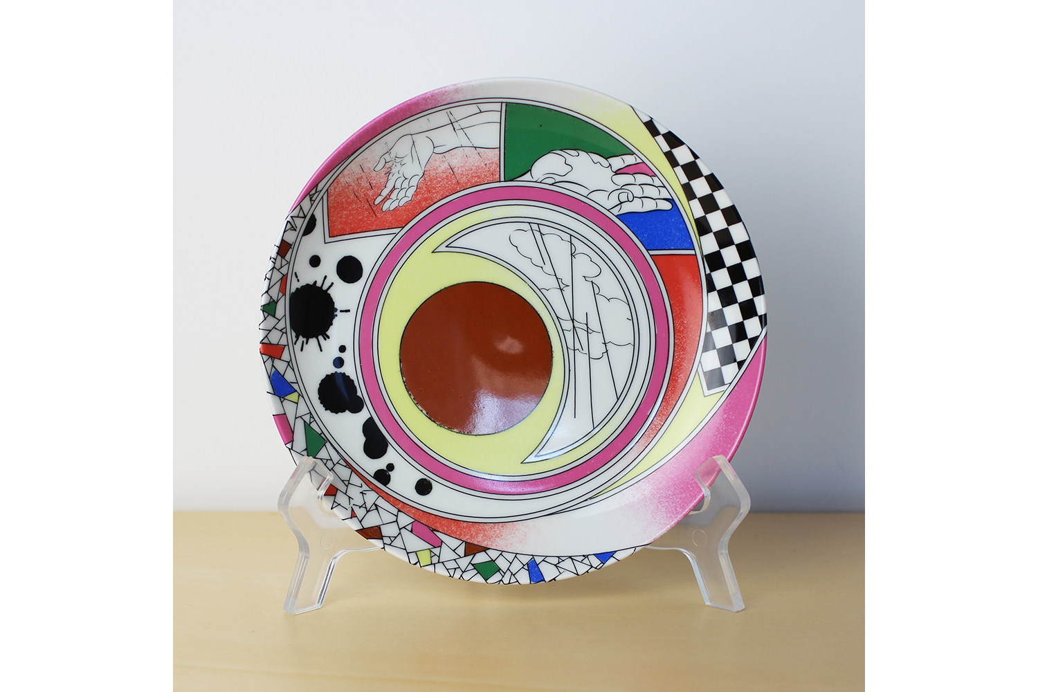
Continued Experimentation
Although L’Arpenteur is tonally distinct, I intended to revisit and integrate elements from my earlier experimental comics, created with British publishing house Landfill Editions. In these earlier books I explored ways to enhance the narrative through paper choice, innovative printing techniques and the use of Pantone spot colors.
Spanning a continuous series of books published since 2016, I crafted short stories connected through interstitial spreads: vivid, hyper-colored cut-ups that combined panels from various parts of the book. These collages created unique links, highlighting the interconnectedness of the stories. I’ve reintroduced this collage-driven technique in L’Arpenteur, but with a fresh approach. This time, I’ve infused it with more narrative depth. Without revealing too much, the central turning point in the story takes the form of a collage, aiming to convey the blending of the present with memories of the past, where fantasy “bleeds into” reality.
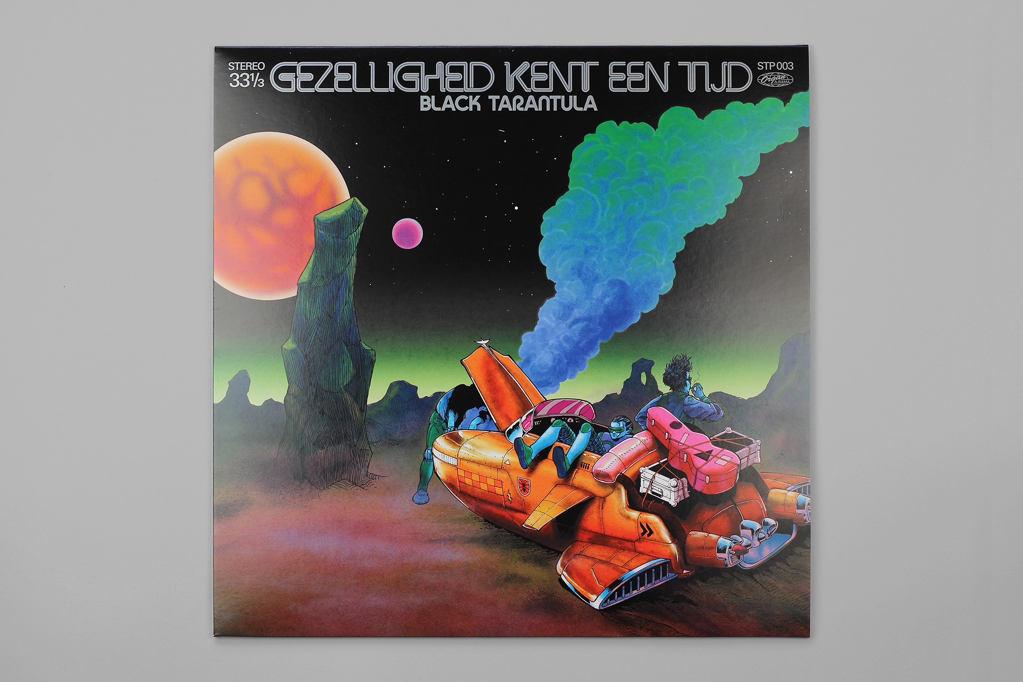
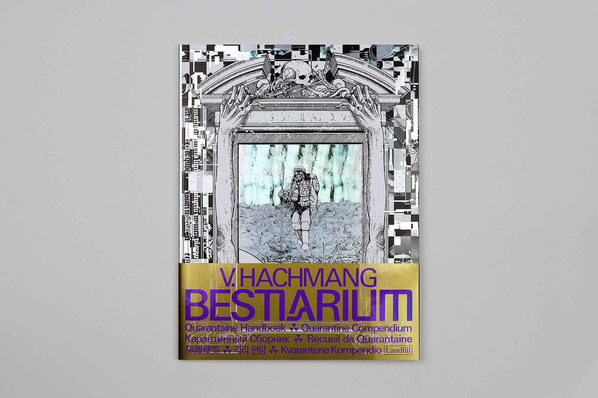
In line with its most obvious predecessor in this series, Bestiarium (2021), L’Arpenteur continues the use of my custom, fully fluorescent color palette. This is a set of colors I’ve been refining for over a decade. These vivid, day-glo hues are ideal for capturing the artificial, otherworldly tones of chemical spills and neon lighting, while also evoking the magical bursts of twilight skies.
For this project, however, I aimed to better harness muddy, earthy tones using neon spot colors—an especially challenging task. To achieve this, I developed a new method for mixing these spot colors, allowing me to strike a delicate balance between the stark artificiality of neon and the earthy beauty of the natural world.
 |
 |
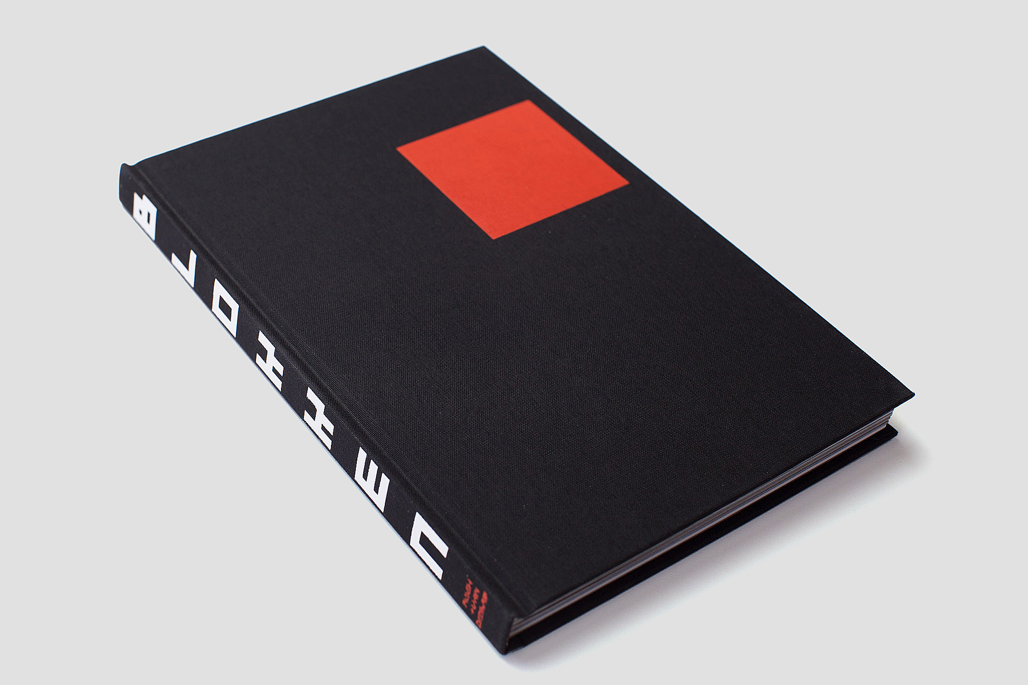
L’Arpenteur, Viktor Hachmang (French translation by Basile Béguerie)
Published by Casterman, Brussels, Belgium, January 2025
Hardcover, 88 pages, ISBN: 978-2-203-27652-9